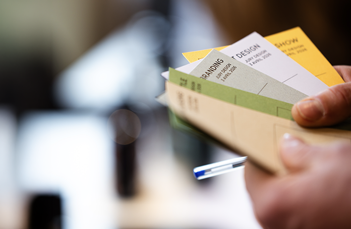
DESIGN competition
Olio Nuovo Days 2026 — Design Competition Results
Under the presidency of Octave de Gaulle, French designer and founder of Spade Agency, the Olio Nuovo Days Design Competition celebrates excellence in packaging, branding, and visual identity within the olive oil.
On this occasion, he brought together an exceptional jury, composed of leading figures from design, creative industries, and the sensory world.
His work explores the intersection of object, material, and narrative, bringing together industrial design, craftsmanship, and artistic direction. This year’s selection reveals a remarkable diversity of creative expressions, where heritage, innovation, and sensory storytelling converge with precision and intent.
BEST OF SHOW
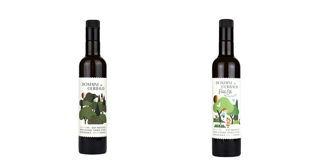
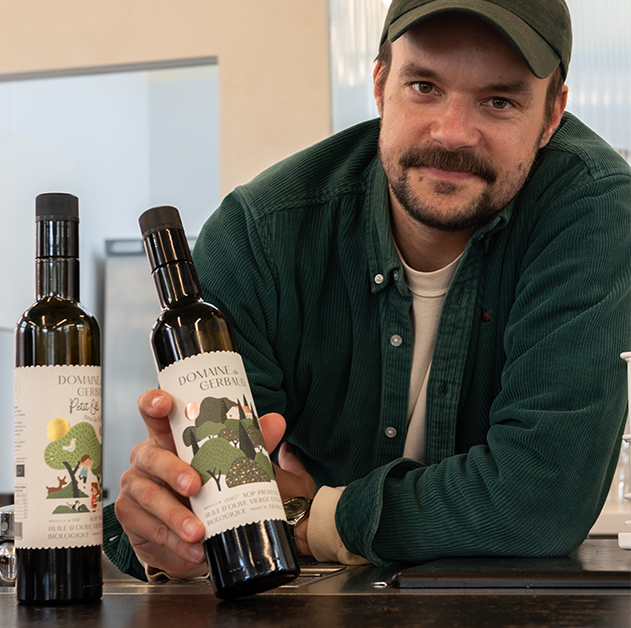
- DOMAINE DE GERBAUD — AOP Provence BIO & Petit Oli — France
JURY COMMENTS: “DOMAINE DE GERBAUD stands out for the originality and unique charm of its concept. By breaking away from the traditional conventions of Premium Olive Oils, the project has developed its own distinct, instantly recognisable style.
The jury was particularly impressed by the evocative power of the illustrations and the shape of the label, which introduce a sense of innocence and generosity rarely seen in this category.
The overall design succeeds in establishing a strong personality without ever compromising perceived quality. A free-spirited yet masterful concept. Special mention for the Petit Oli proposal, which invites young people to taste and share the pleasure of EVOO…”
JURY GRAND PRIX

- CHRISEO — Delicate & Intense — France
JURY COMMENTS: “CHRISEO stands out for the coherence and mastery of its expression, rooted in a distinctly high-end visual universe. The project unfolds a rich imagery, driven by evocative photography that calls upon the Mediterranean, dolce vita, simple gastronomy, and a timeless Greek way of life. These visuals, seamlessly articulated with the other branding elements, create a fluid and highly desirable narrative.
The bottle shape, both understated and refined, reinforces this sense of timelessness, while the overall approach conveys a controlled modernity, drawing with precision from the codes of fashion.
A fully accomplished proposition, combining evocation, desirability, and exacting standards”.
BEST PACKAGING
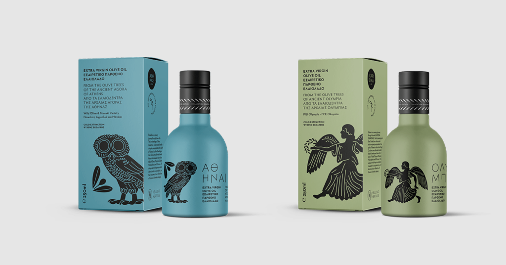
- THE MASTER MILLER — Athenas Doron & Charisma Dios — Greece
JURY COMMENTS: “THE MASTER MILLER Historic stands out with an original, confident, playful, and highly graphic packaging proposal. The project moves beyond the status of a simple culinary product, placing olive oil within a broader narrative — that of the terroirs from which it originates and which it has traversed for millennia.
In contrast to the luxury codes often associated with exceptional olive oils, this packaging unfolds a rich and accessible story, recalling the central role of olive oil in the history and culinary traditions of the Mediterranean, reaching back to the founding myths of ancient Greece. This narrative ambition is supported by a perfectly controlled execution, which enhances the overall perceived quality.
The packaging thus becomes a true object in its own right, as enjoyable to offer as it is to receive. A distinctive and generous proposition, with strong commercial potential”.
BEST BOTTLE
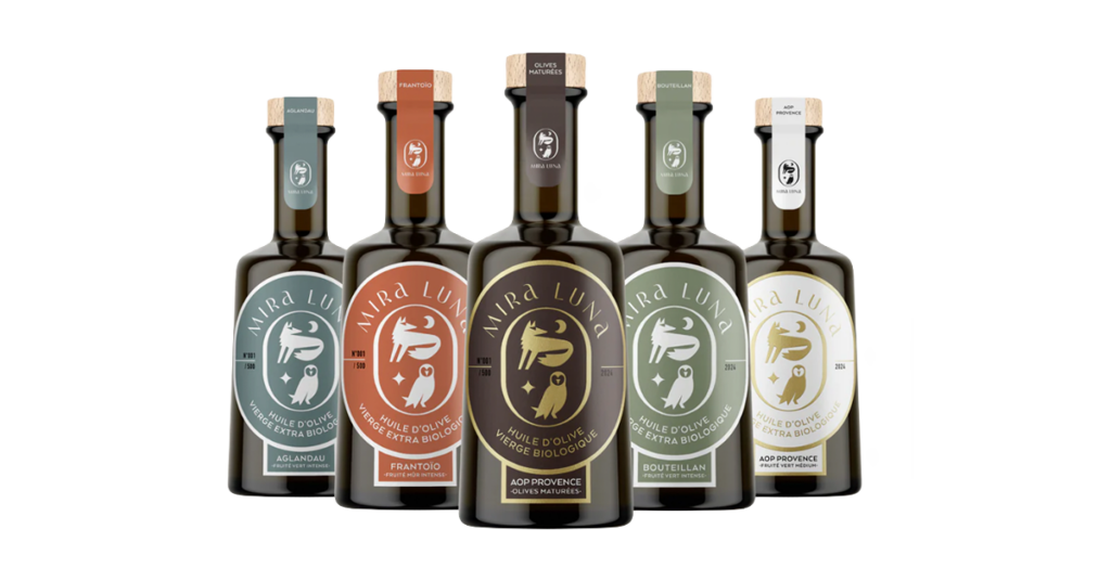
- DOMAINE MIRA LUNA — France
JURY COMMENTS: “Domaine Mira Luna particularly impressed the jury with the coherence of its design. The bottle, instantly recognisable by its silhouette, blends harmoniously with the shapes of the label and the seal.
The overall effect is enhanced by finely crafted branding, supported by a precise and evocative colour palette, which helps to create a unique world. The graphic elements, inspired by the night, reinforce a sensitive imagery rooted in nature, contributing to a strong perceived quality.
This overall coherence, both formal and narrative, led the jury to recognise this entry in the Best Bottle category”.
BEST BRANDING
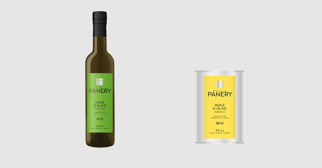
- DOMAINE DE PANÉRY — Bottle & Tin — France
JURY COMMENTS: “Domaine de Panéry impressed the jury with the quality and mastery of its branding elements, which successfully articulate a refined balance between heritage and contemporary codes. The logo, the reinterpretation of the fleur-de-lys coat of arms, and the overall graphic language together create a precise and modern identity, reflecting both the quality of the product and the richness of the estate’s heritage.
This level of rigor is consistently expressed across a wide range of formats, from the metal tin to the tall, elegant glass bottle. Despite this diversity, the brand’s coherence remains intact, supported by a particularly well-judged and appealing color palette.
The result is a remarkably balanced product, equally at home on the most traditional tables as in the most contemporary dining environments”.
GREAT DESIGNS
- CASA DE SANTO AMARO – In Memoriam “Olival do Pomar” — Portugal
- CŌRES Extra Virgn Olive Oil — Greece
- DOMAINE JÒLIBOIS — Product Line — France
- ESPORÃO — Herdade di Esporāo — Portugal
- ESTOUBLON — Product Line of Monovariétales — France
- NAI 3.3 — Product Line — Croatia
- OLEASTRA — Product Line — Tunisia
- SAVOLA FOODS — Türkiye
- THE MASTER MILLER — Product Line — Greece
FINALISTS
- ALMAZARAS DE LA SUBBETICA — Rincón de la Subbética (DOP Priego de Córdoba) — Spain
- CASA DE SANTO AMARO — Casa de Santo Amaro Praemium, Portugal & Casa de Santo Amaro Prestige — Portugal
- COOPERATIVA DE OLIVICULTORES DE VALPAÇOS, CRL. — Product Line Rosmaninho Gourmet — Portugal
- DARMMESS — Darmmess — Lebanon
- ESTOUBLON — Flacon Couture — France
- DOMAINE DE LA SENANCOLE — Product Line — France
- EVOO FACTORY — Noor Fes — Morocco
- JORDAN OLIVENÖL — Bambatsa Nativ Extra (Tin), Greece
- MASSIMO RADANO — Organic Extra Virgin Olive Oil Valentina — Italy
- NOVA VERA GIDA VE TARIM — SAN.TIC.A.S Product Line — Türkiye
- OIKOS ANTALIS — Product Line Cuvée Agios Illias & Skourochori — Greece
- OIKOLOGIKO ELAIOTRIVEIO EE — Deltami — Greece
- OLEUM LAGUNA — O de Oleum Laguna de Blas — Spain
- OOTOPIA — Product Line – Blend & Manaki & Koroneiki — Greece
- OPG SAKAC — Damaval — Croatia
Design Competition — Additional Information
Producers not featured on this page who entered the Design Competition will receive individual feedback within the next two months.